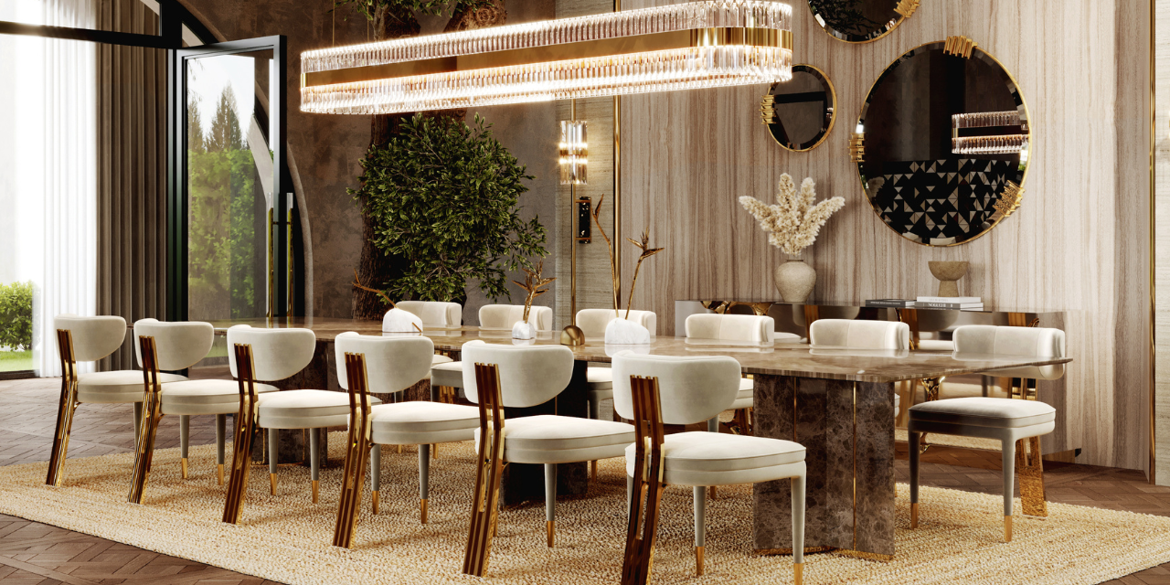
Luxury dining chairs are more than just seating; they are essential elements that define the aesthetic and atmosphere o
Handmaid’s Tale: The Beauty Of The TV Show’s Set Design
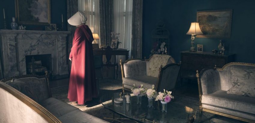
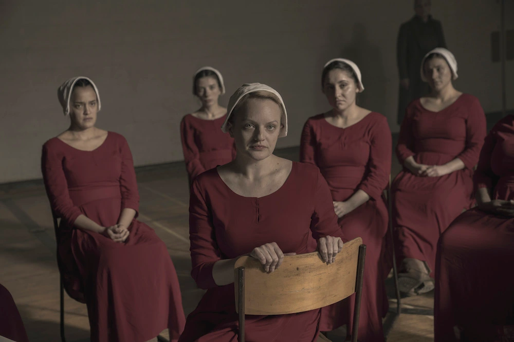
Handmaid’s Tale: The Beauty Of The TV Show’s Set Design – It only makes sense to go get The Handmaid’s Tale, one of the most timely television programs currently airing, on this day when we are all celebrating the independence of the United States. The Handmaid’s Tale, one of the most well-liked television series of 2017, is getting its concluding season soon. It is set in a dystopian future in which the independent United States closes its borders to the outside world and establishes its own totalitarian and religious regime. Discover the exquisite design of this TV show’s set by reading this LUXXU Blog article.
See also: Get Ready To Make A Statement With LUXXU’s Mix And Match Possibilities!
In this house, little things matter a lot, as Offred’s character stated in the pilot episode. This holds true for the entire Hulu TV series as well as the Commander’s home. Julie Berghoff, the production designer, and Evan Webber, the art director, demonstrate through their incredible work that the little things really do matter a lot in a production where nothing and no detail is left to chance. Let’s examine…
One of the realities we fear most in the modern world is probably Gilead, the newly discovered USA, which defies everything we know about independence and free will. However, today’s discussion isn’t about dystopian politics; instead, we’re talking about the superb set design for The Handmaid’s Tale, which demonstrates the continued existence of modern cinematography artwork.
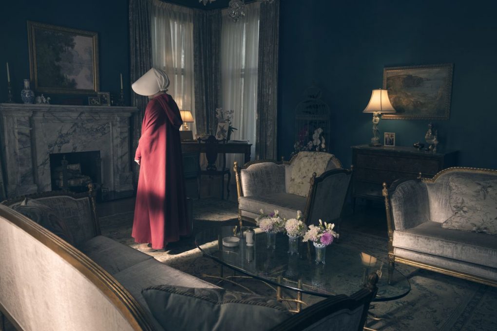
First things first, the production design team worked hard to ensure that every aspect of this television adaptation of The Handmaid’s Tale felt genuine. The sets were constructed using only genuine materials. Everything is extremely genuine and real, including the furniture, paintings, and real hardwood. Apart from that, every other factor was considered: the creation and design of the interiors took into account textures, patterns, and even sounds.
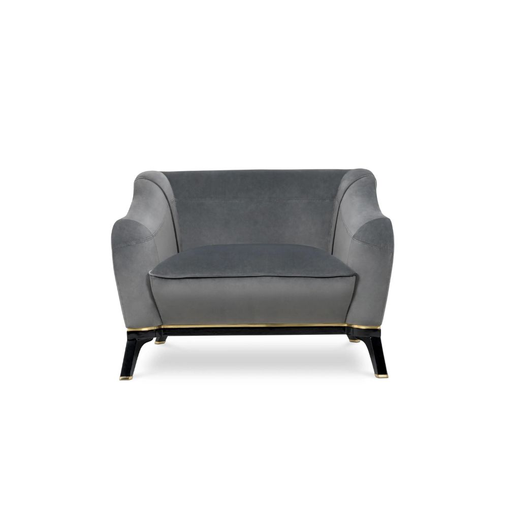
GET THE LOOK
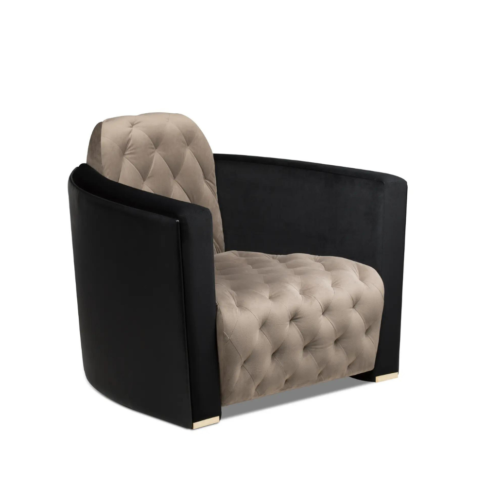
Saboteur Single Sofa

The Details Put Into Handmaid’s Tale Are Phenemonal
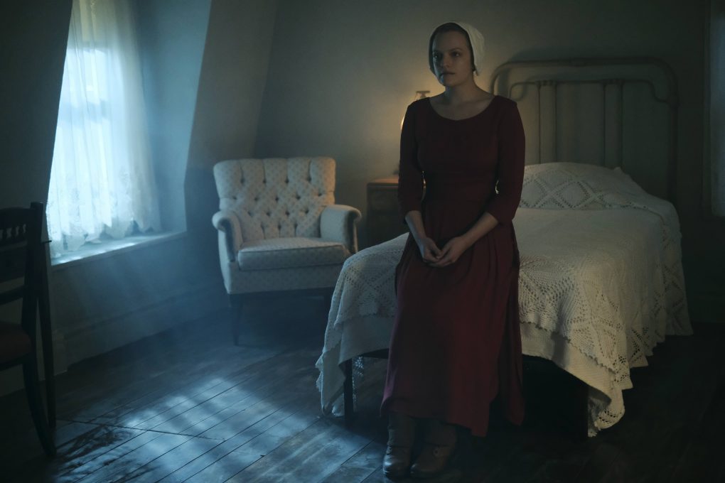
Offred’s room, according to Berghoff, was among the most challenging to design because it is so empty. There is no personality, no color, or art. It is a method of removing the handmaid’s belongings and cutting her off from the outside world. Despite the fact that she is not permitted to write, the set designer decided to install a desk in her room because she previously worked as a book editor. They ultimately devised a strategy to turn her room into a constant reminder of what she is unable to possess.
GET THE LOOK
Saboteur Single Sofa
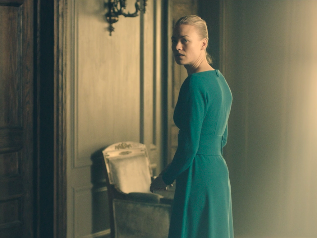
Almost everything in the world of The Handmaid’s Tale is colored. The color schemes of the entire set ultimately took inspiration from the characters’ costumes. Berghoff stated that she wanted to support Ane Crabtree’s historical costumes while maintaining a contemporary vibe. She picked colors that would go well with the characters’ backstories and wardrobes, like Offred’s room, which has a sanitarium-like feel thanks to the use of white. On the other hand, Serena Joy, the Commander’s wife, has rich blues designated for her spaces.
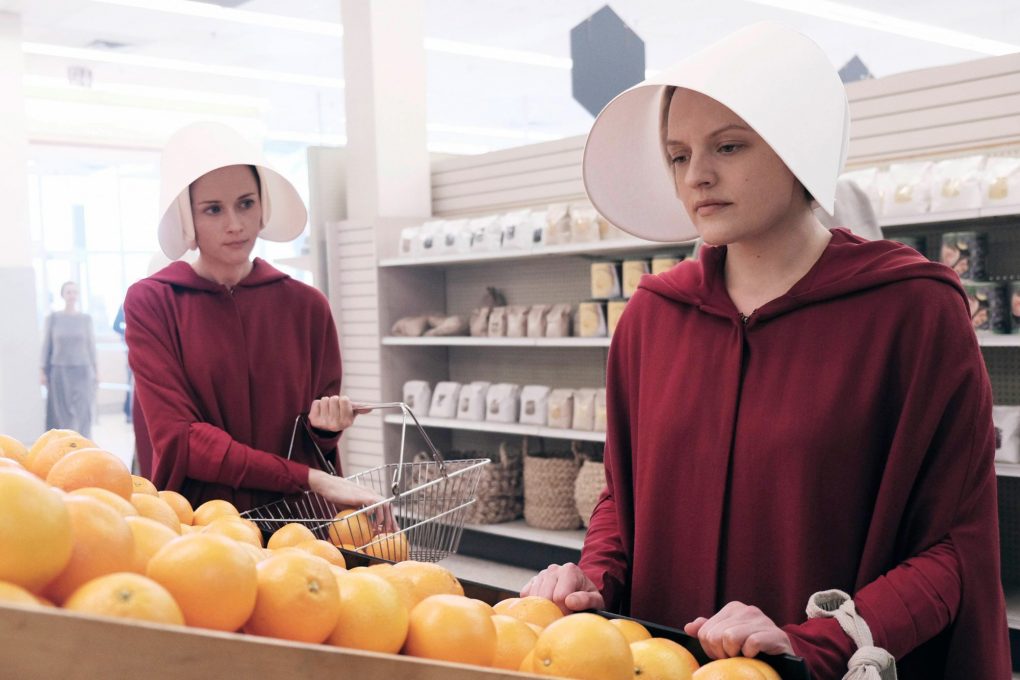
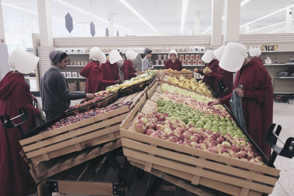
But some of our all-time favorites are the grocery store sets. All of the product tags were made by the art department, who took their time. The act of creating tags and labels required the development of a new symbolic language in a society where women are not permitted to read. The peculiar labels with no words are perhaps what makes it the most unsettling, given that the brightly lit grocery store otherwise does not seem out of place in the modern world.
See also: Get Your Home Library Ready With Stunning Fall Decor!
If you enjoyed this article regarding Handmaid’s Tale: The Beauty Of The TV Show’s Set Design then make sure to check out our socials to find news, inspirations, and more interior design ideas: Pinterest | Facebook | Instagram.
